Project
Mobily
Role
Design System Lead
Focus
Design Systems, Figma, RTL/LTR
Team
1 UX Designer, 1 Product Owner, 2 Engineers
Building a Scalable Bilingual System
Most design systems are built for one language. Mobily needed one that works for two — simultaneously, at every level. Built as a consultant and sole owner, from tokens to flows: covering App and Desktop, with LTR and RTL support.
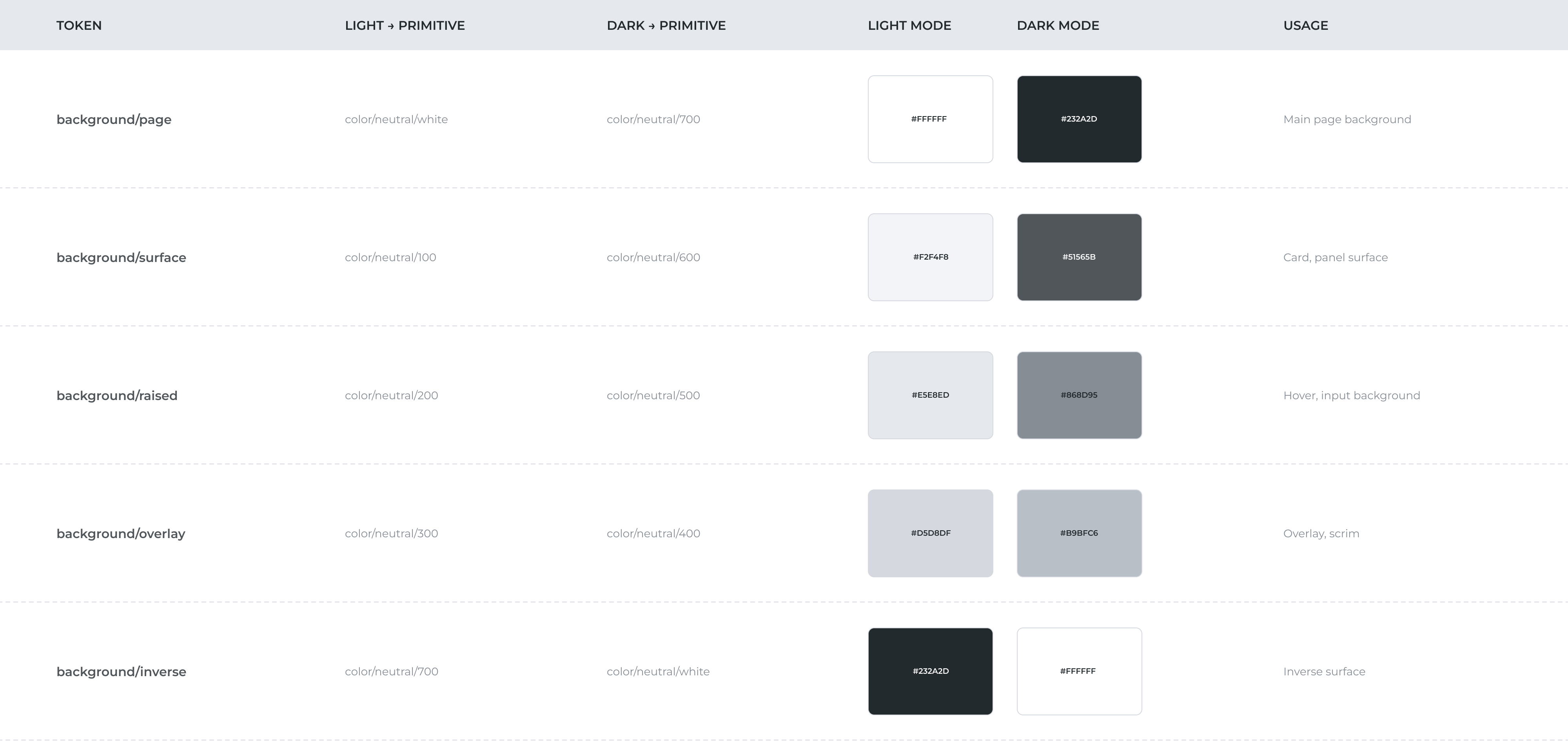
Colour
The first decision was separation. Hardcoding colour values directly into components makes theming, dark mode, and brand updates brittle. By separating primitives from semantic tokens, every colour decision becomes traceable and swappable. 15 product brand colours, full neutral and primary scale, WCAG contrast ratios built in.
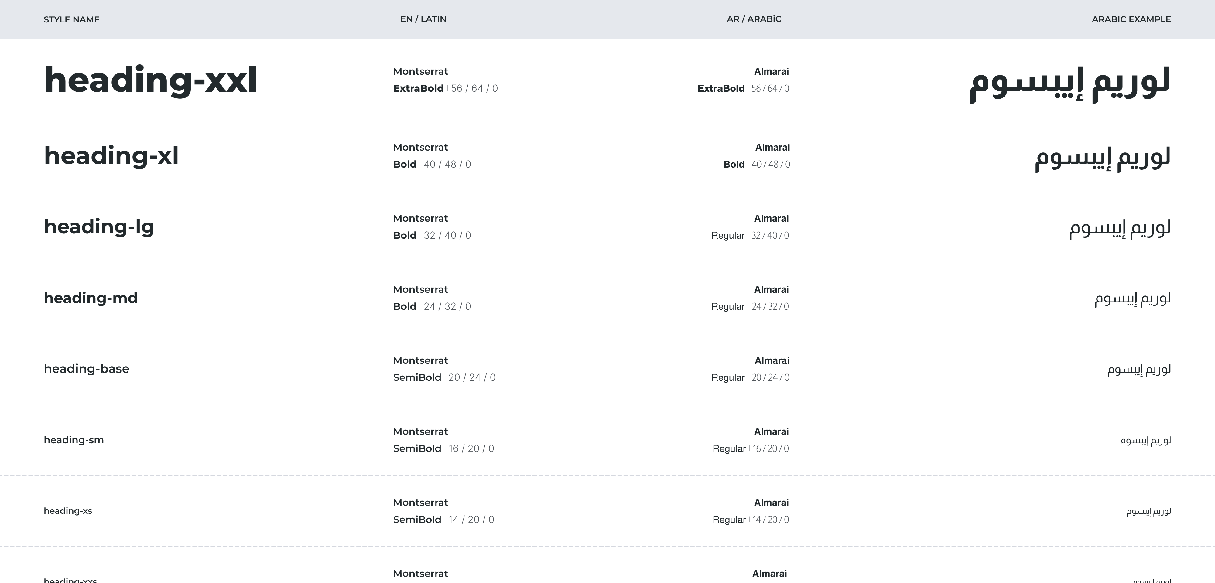
Typography
Arabic and Latin aren't just different scripts — they have different optical sizes, stroke weights, and rhythm. The decision was to pair Montserrat with Almarai — one typeface per script — and build a shared scale so switching language preserves hierarchy. 24 text styles, one system.
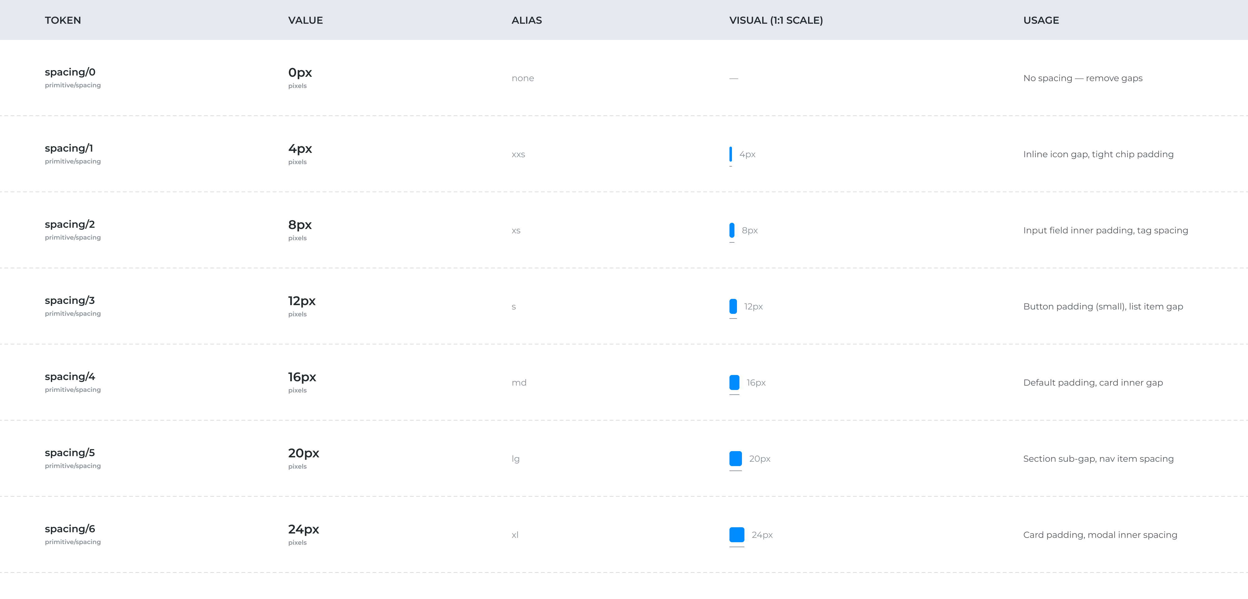
Spacing
Arbitrary spacing creates invisible inconsistency. A strict 4pt base scale gives every spatial relationship a common rhythm. Each token is documented at true size. Designers read intent at a glance, engineers verify without converting units.
Visual Equivalence
Every fixed or flexible decision comes back to one question: does this component need to feel the same visual weight across languages, or does it need to fit its content? Components that anchor layout rhythm carry fixed heights. Components whose value lives in their content breathe vertically.
“The shell is always consistent. The decision is whether the content inside needs room to breathe.”
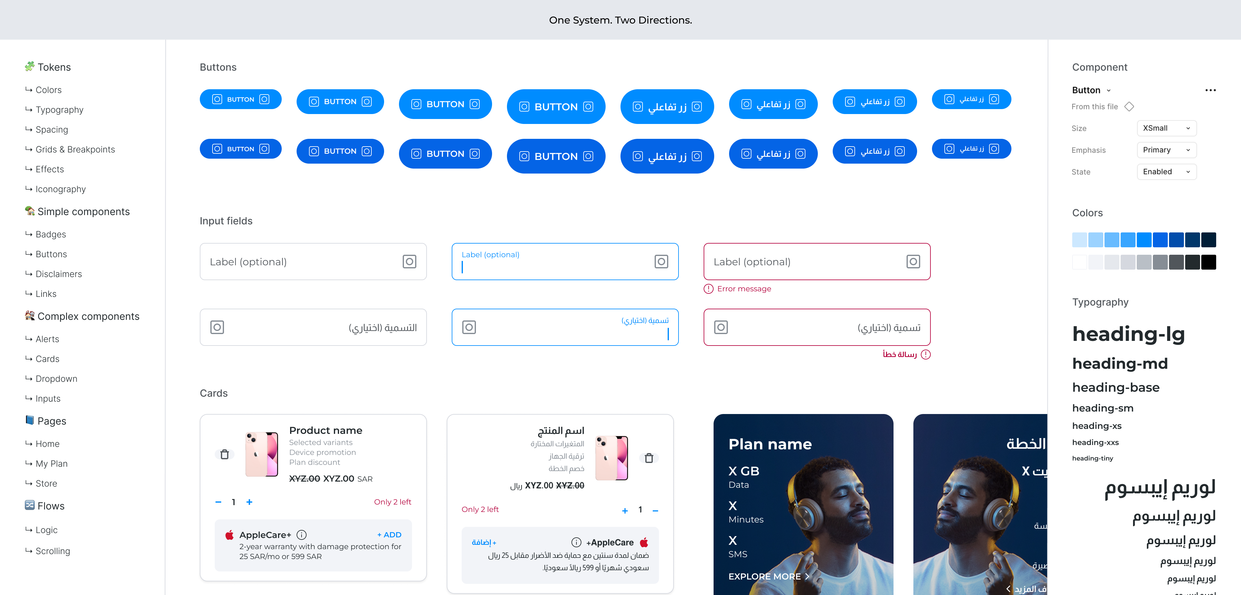
Buttons
Buttons are the clearest application of visual equivalence. Fixed height is enforced across all 4 sizes and 3 emphasis levels, with the type scale handling legibility within that constraint.
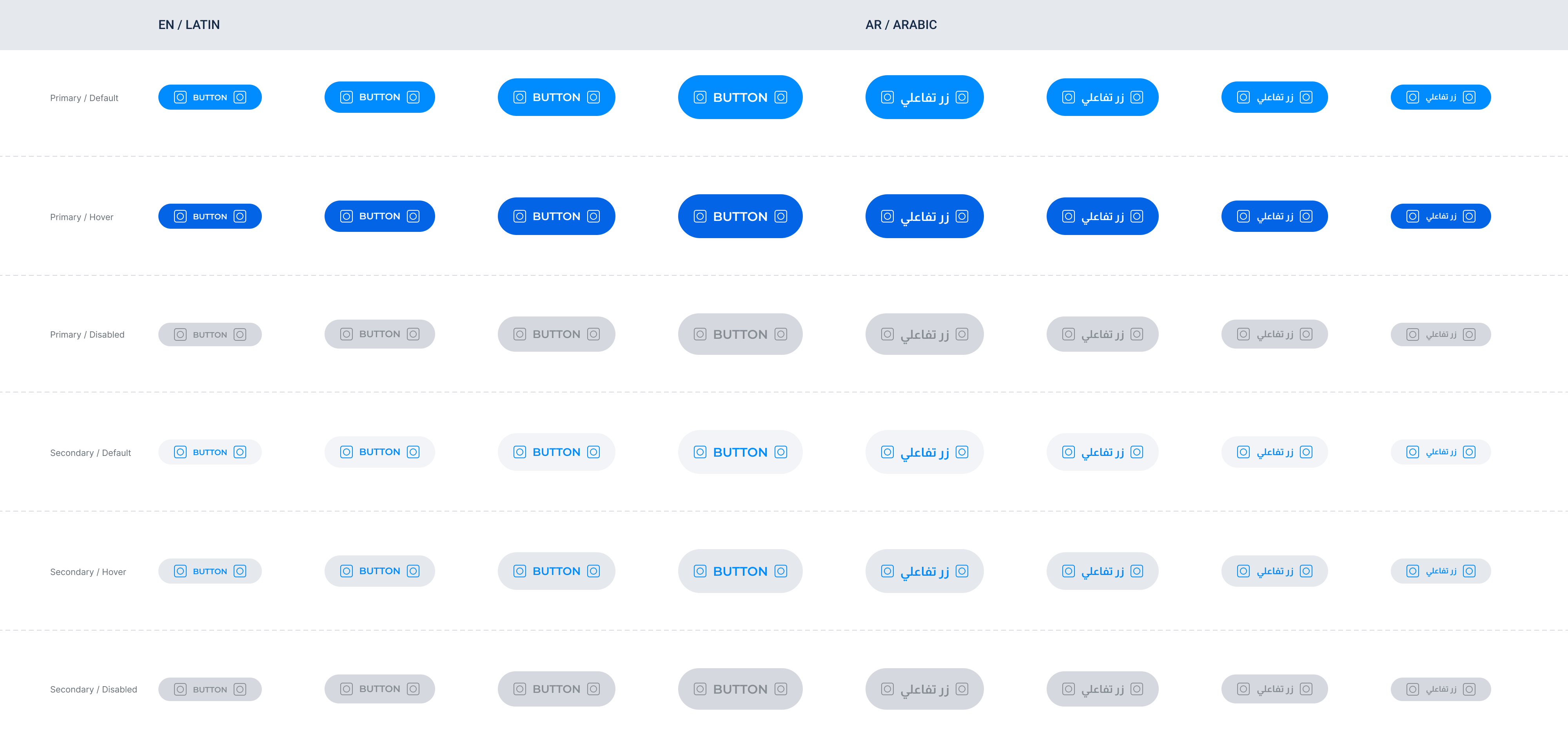
Complex Components
Inputs and headers carry fixed heights. Cards and content blocks are flexible. The shell is always consistent; the decision is whether the content inside needs room to breathe.

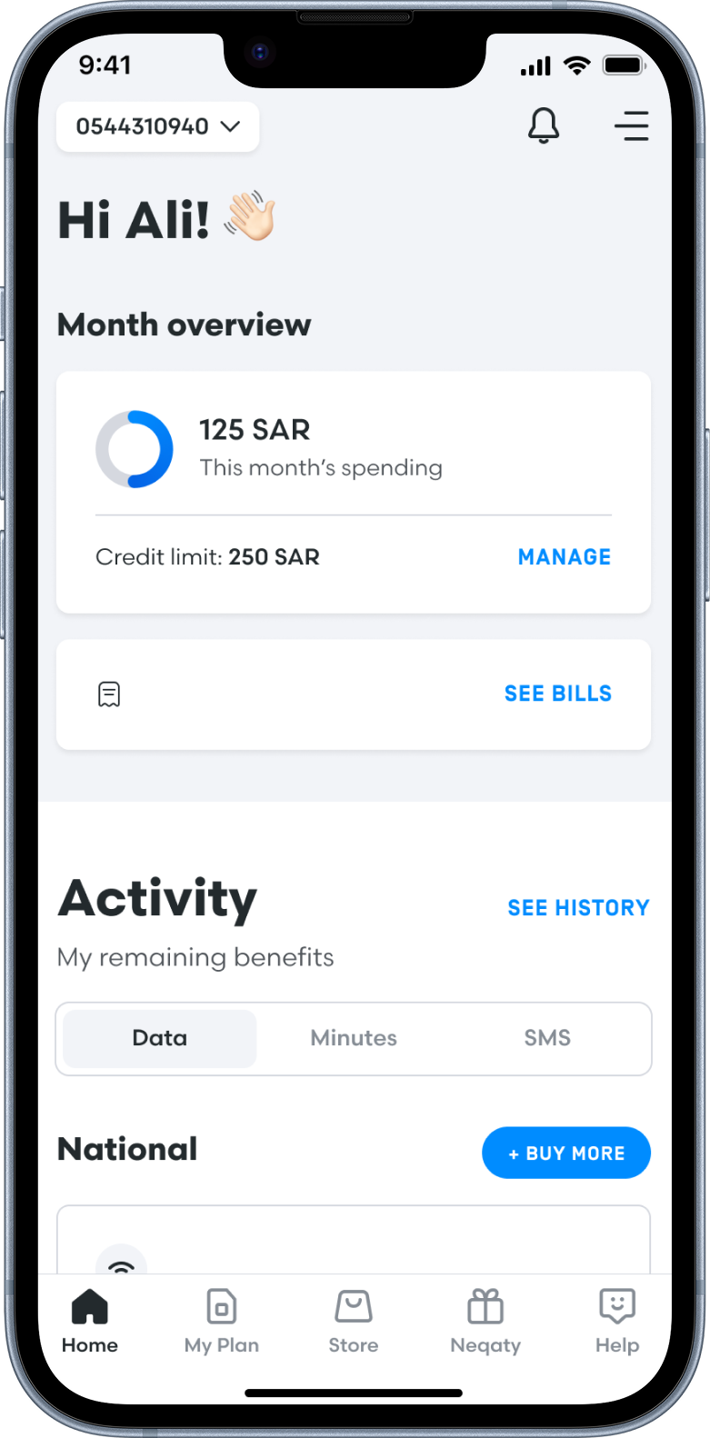
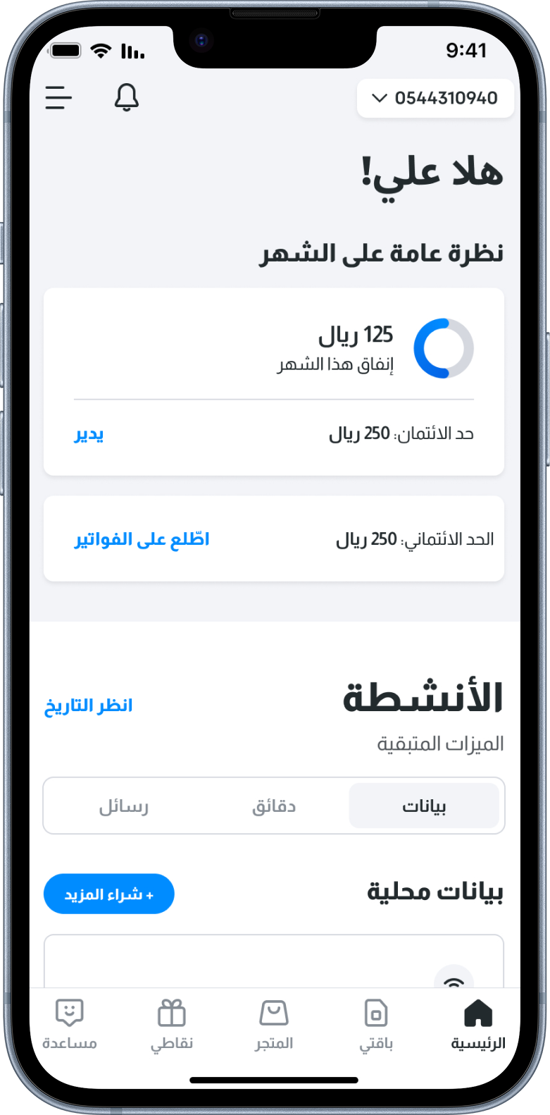
One System, Two Directions
Simple components use dual text nodes and a Language mode switch. Complex layouts use separate LTR and RTL variants because they genuinely mirror rather than just swap text. Developers handle the rest with a single CSS direction: rtl at the page level.
Flows
End-to-end user flows document complete functionality — states, interactions, edge cases. Engineers get everything they need to build without ambiguity: not just what the UI looks like, but a complete map of how it behaves.
